Fealya: making AI-generated art, 12 archetypes and a design system feel like one product
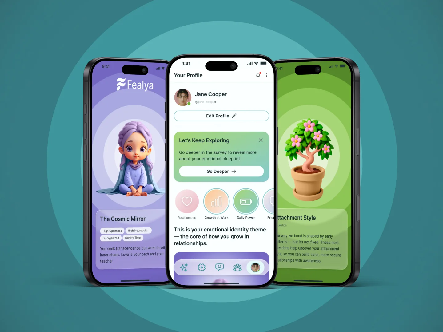
I designed the UI, the illustration set and the developer handoff for Fealya, a mobile app that helps people understand themselves and their relationships. The client brought the concept and the flow. I made it look and behave like one product. A TestFlight build existed. The app was never released.
Brief
The client brought the concept. I owned how it looks, flows and holds together.
The project came through Upwork in April 2025. The client, who was also the founder and CTO, described an app that helps people understand themselves and navigate relationships using AI, psychology, astrology and compatibility scores. He had already written the flow as a PDF and needed it turned into something designers and developers could work from.
The client brought
- The concept, and a written “Phase 1” flow with the target audience: Gen Z and millennials
- The assessments and every question in them
- The archetype names
- “Try a Preview First” and the AI chat where you upload a screenshot or voice note
- The Emotional Mirror idea, from his own ChatGPT experiments
- A list of reference apps: Headway, Finch, Apple Fitness achievements, Notion widgets, Duolingo’s journal, and later Co–Star and The Pattern
I did
- A visual user flow from his PDF
- Low-fi wireframes (my proposal), then clickable prototypes and high-fidelity UI
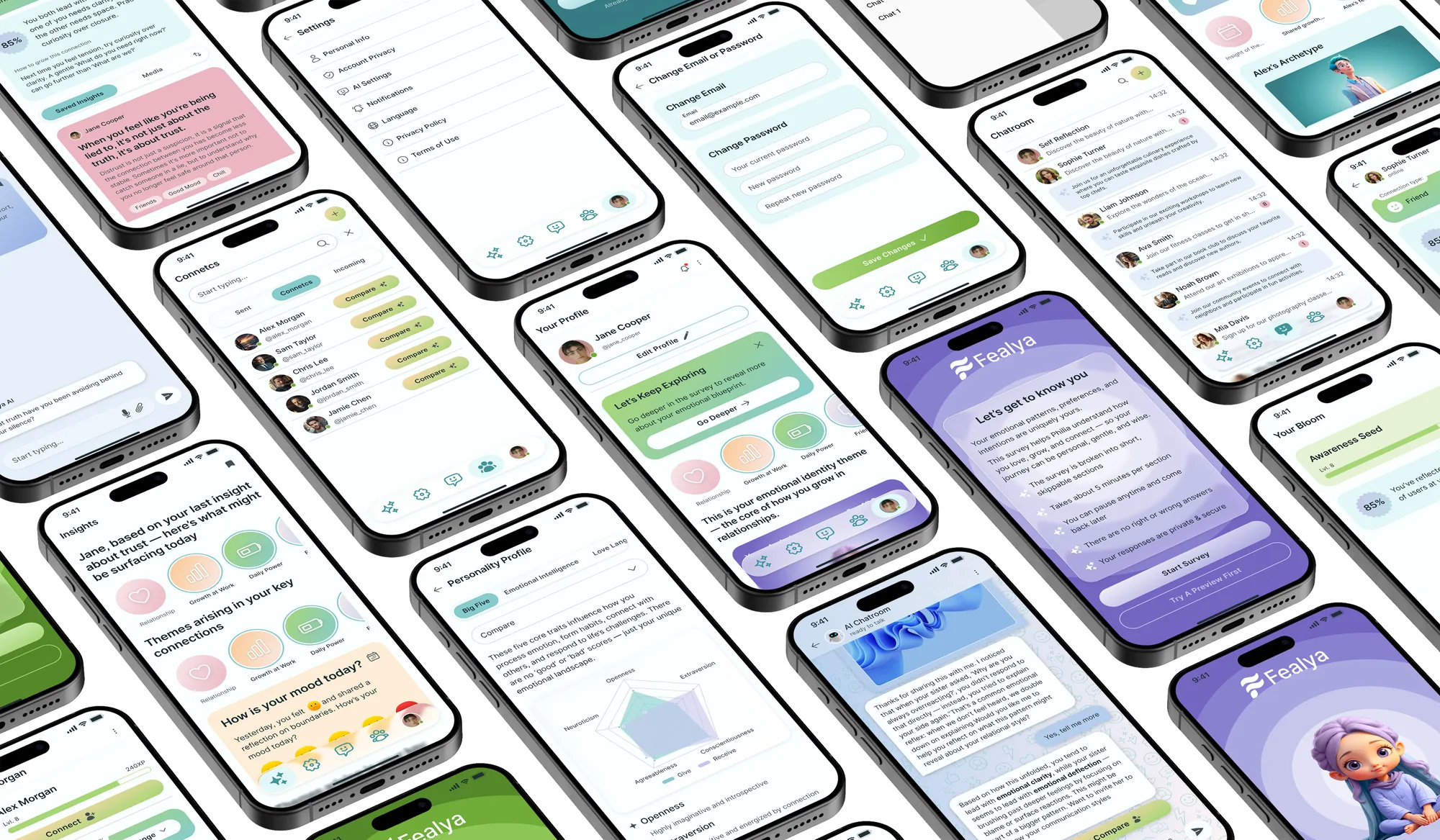
- Screens for onboarding, assessment, insights, AI chat and connections
- The Bloom plant idea, the moodboard and the palette direction
- The look of the archetypes and plants: generation, styling, captions, colour themes
- The design system and its documentation for handoff
Research
Desk research, no user research
I did no user research. The research stage was desk work, and none of it was validated with users. What I had:
- My moodboard and palette. A clear, soft, minimalistic app with 3D elements like a plant, in white, light blue, light green and a little light pink.
- The client’s references. He asked me to include Co–Star and The Pattern. I installed both and clicked through them.
- Informal chats that only confirmed what I already thought.
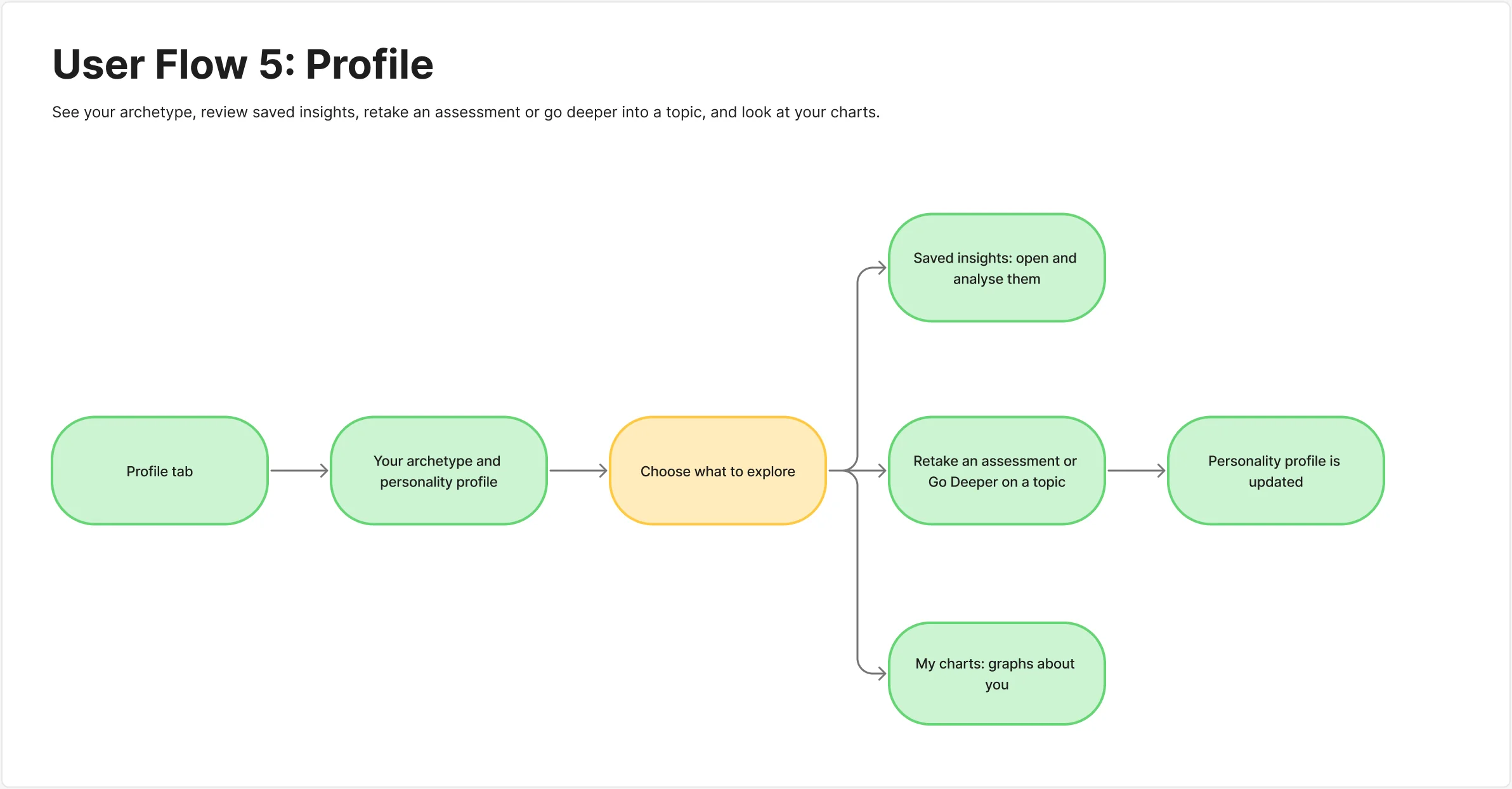
User flows five flows: onboarding, chat, insights, connects, profile
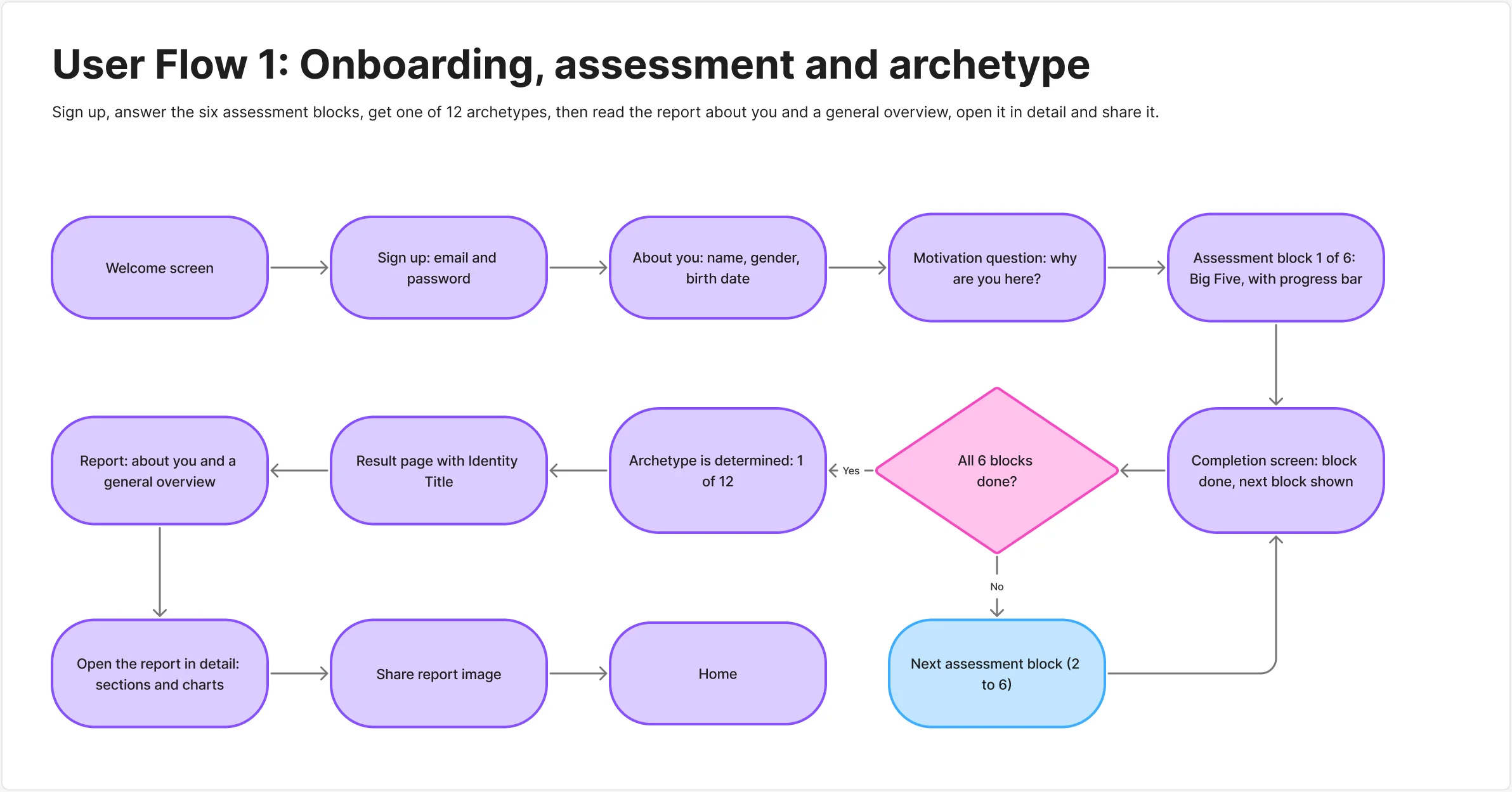
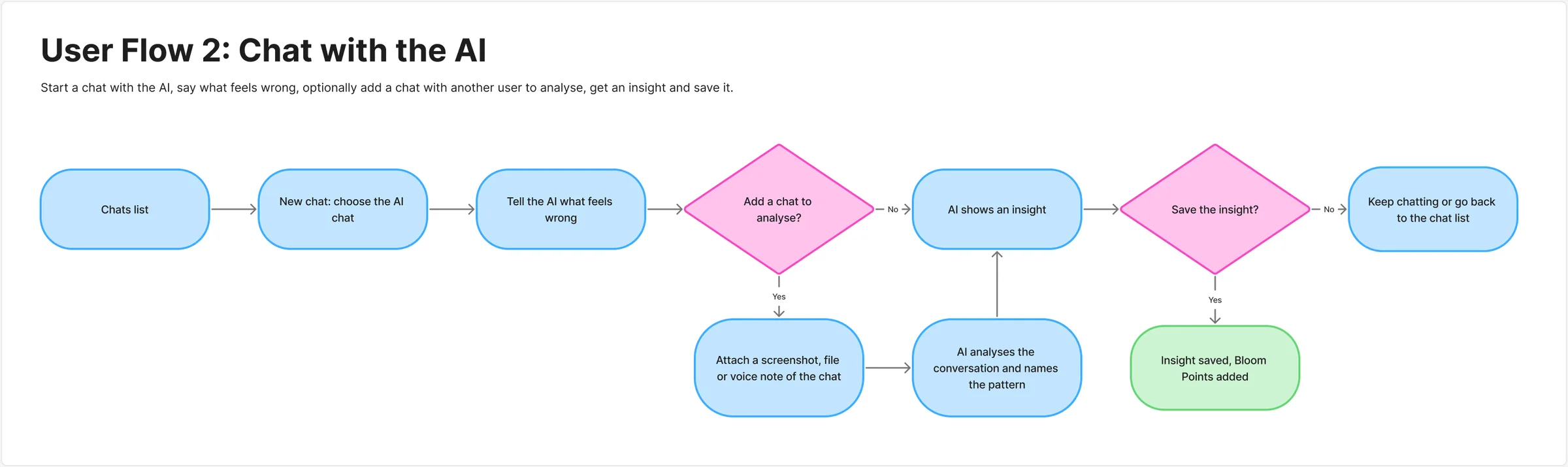
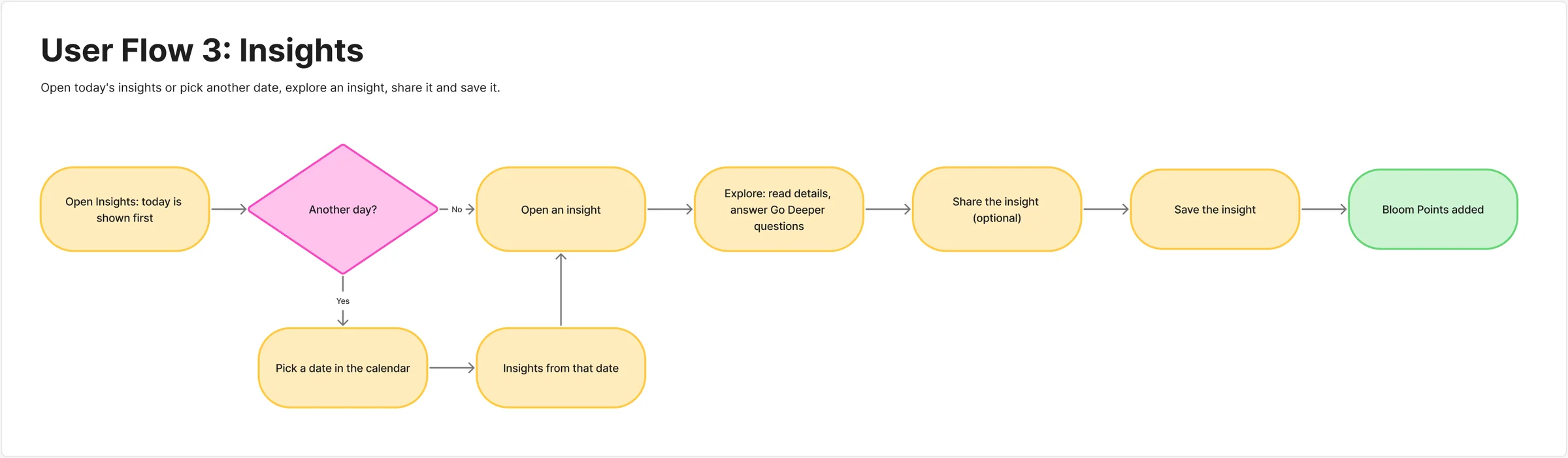
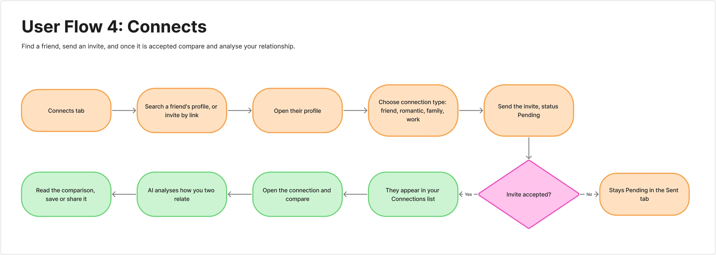
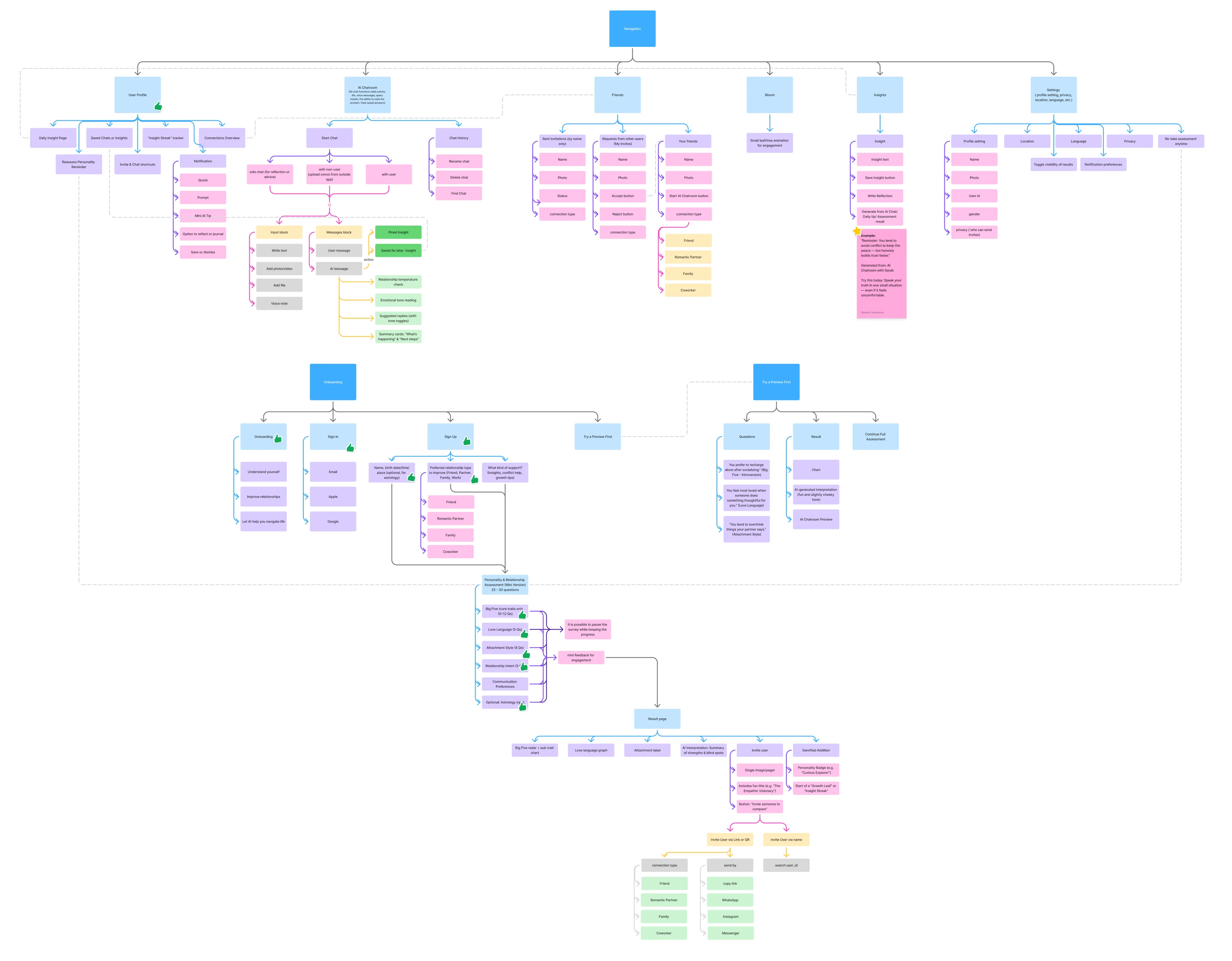
Information architecture navigation, onboarding and the preview
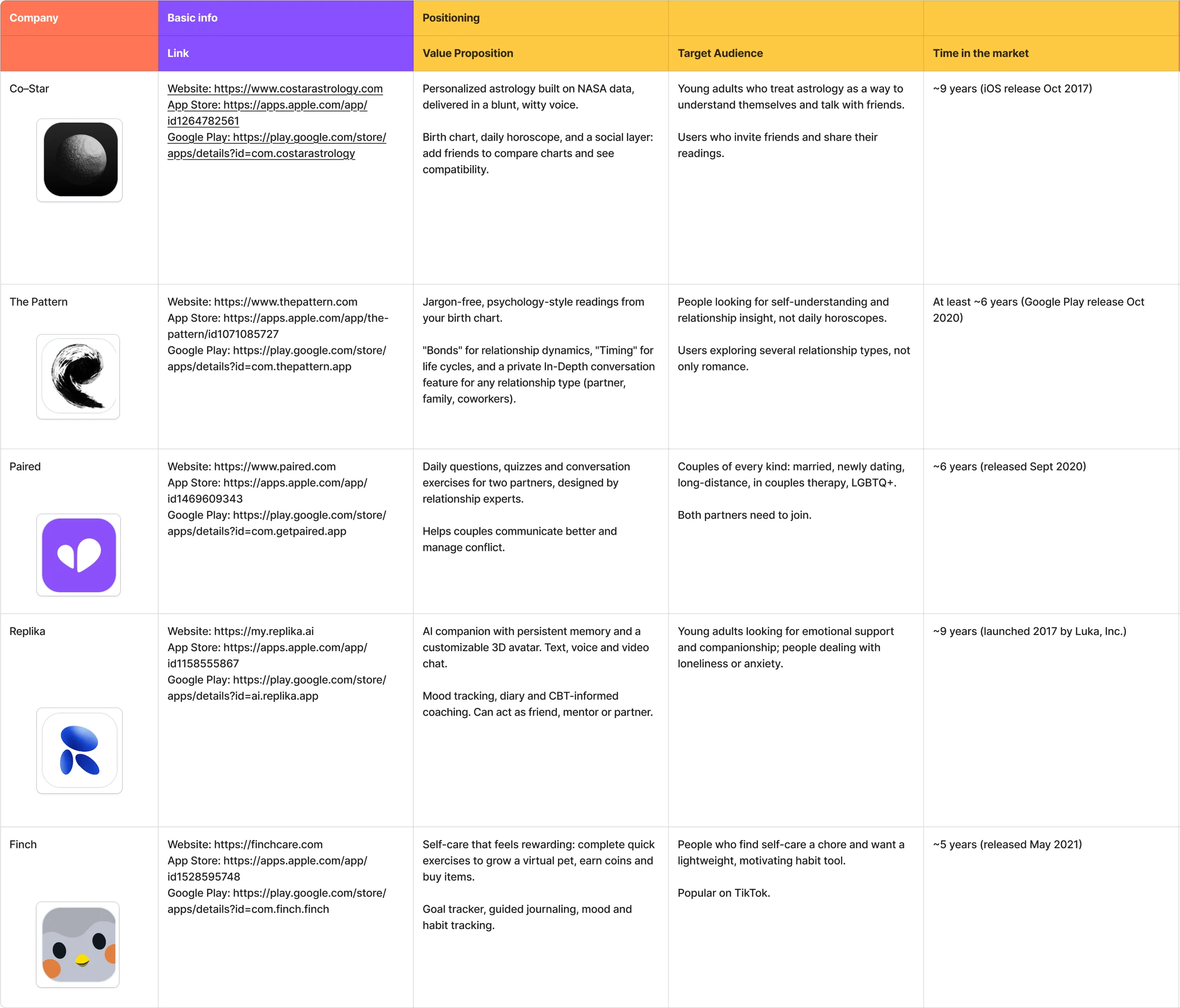
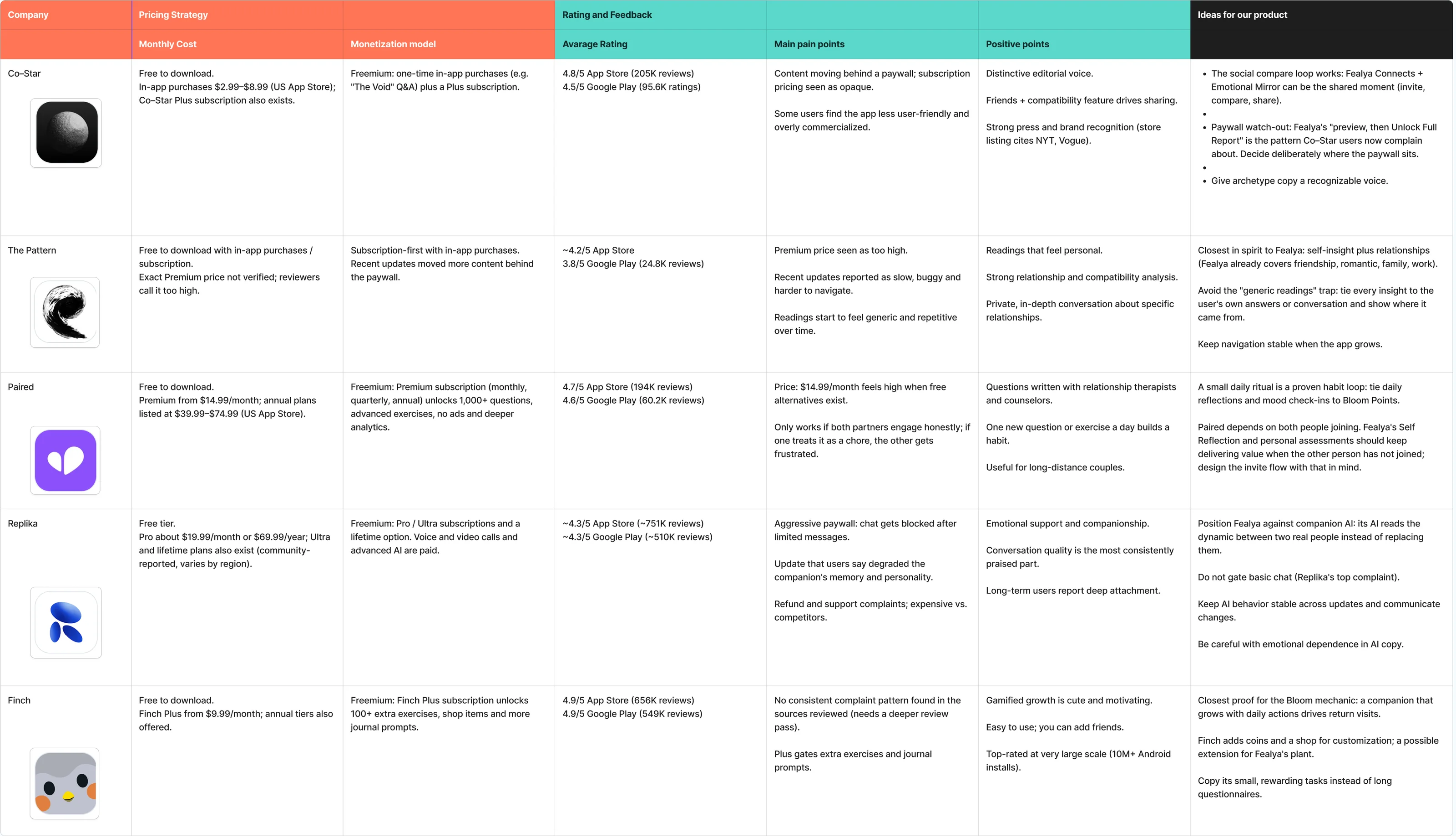
Competitor analysis a desk review of five apps
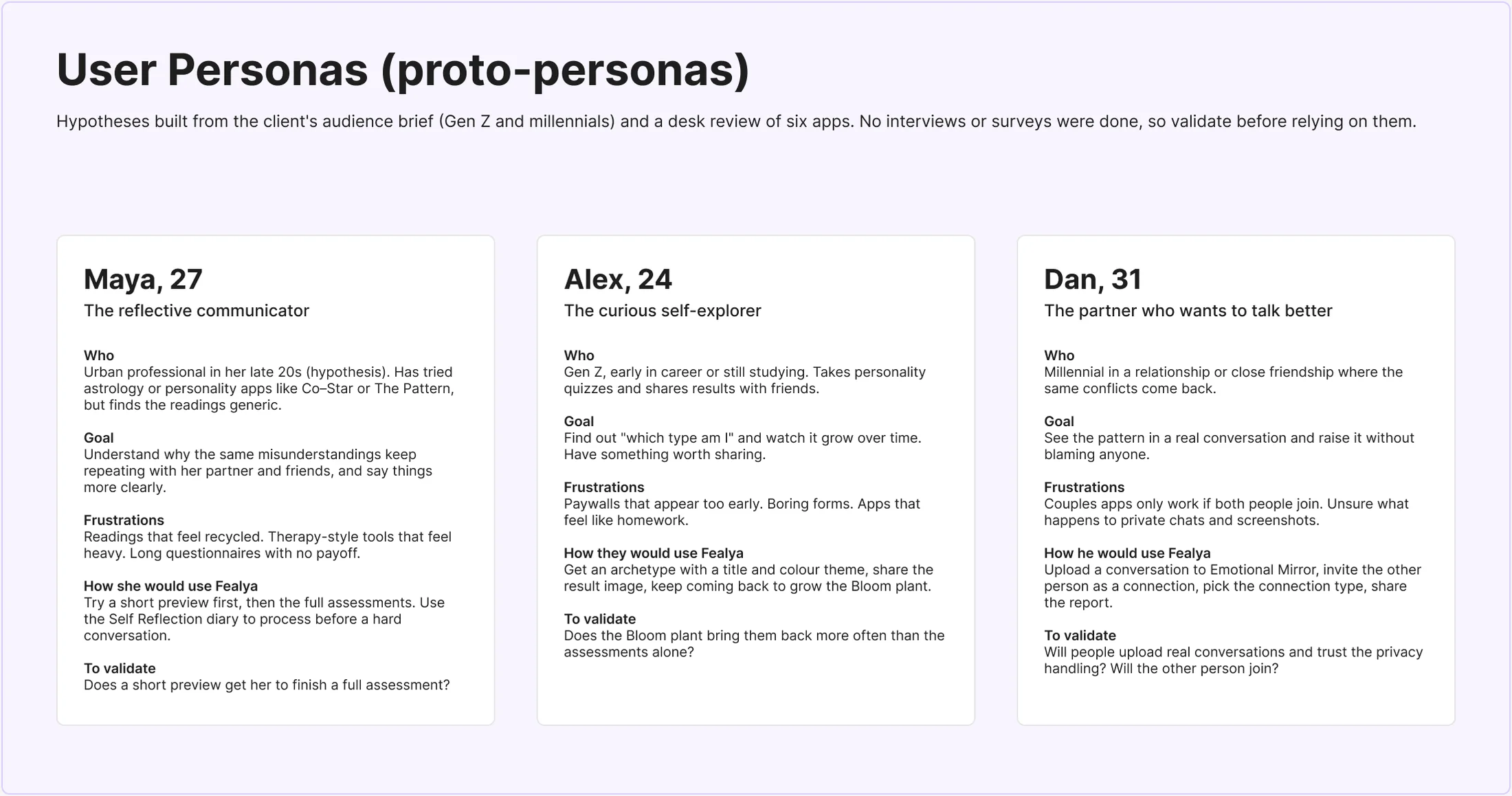
User personas three hypotheses, not findings
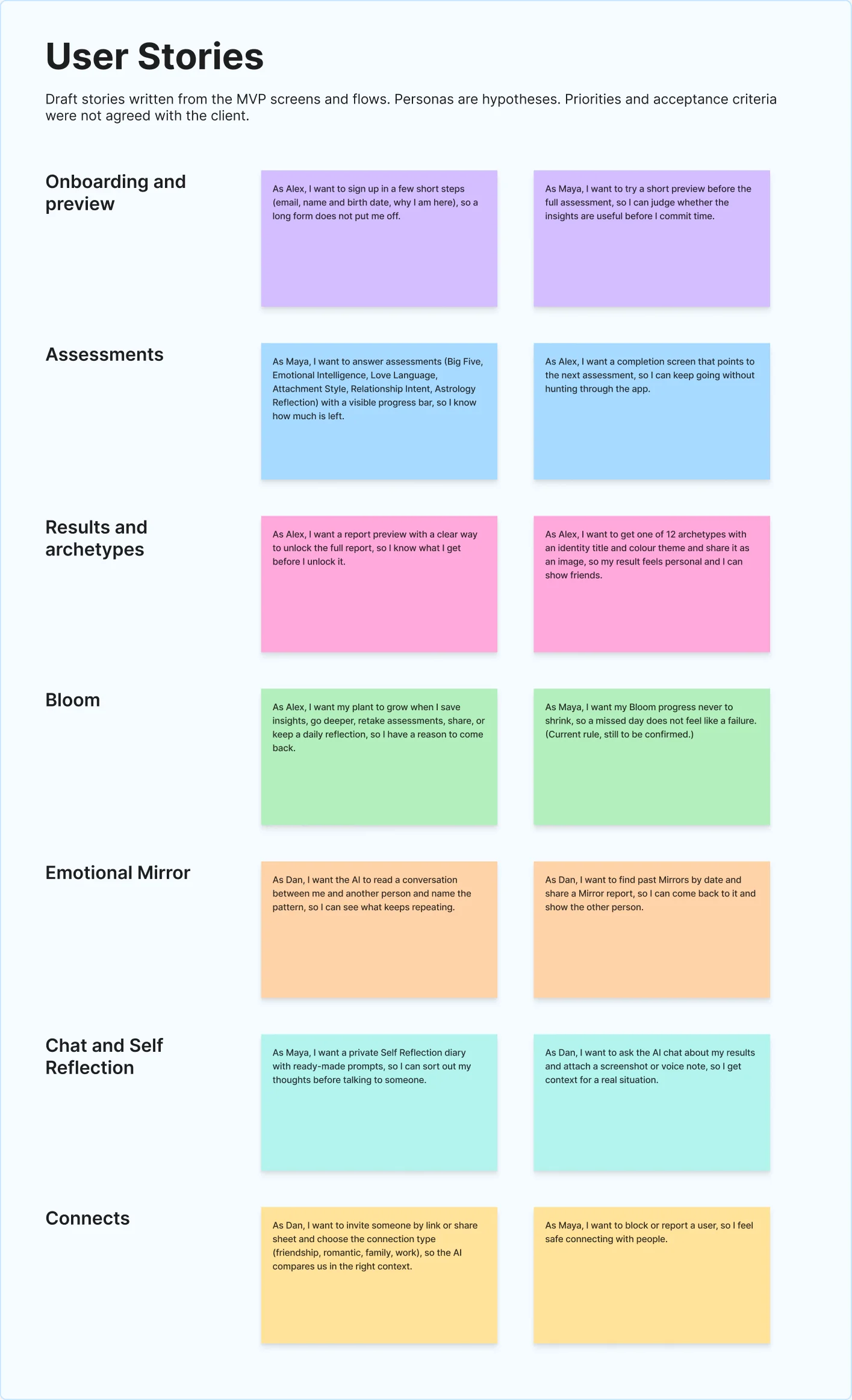
User stories drafted from the MVP screens
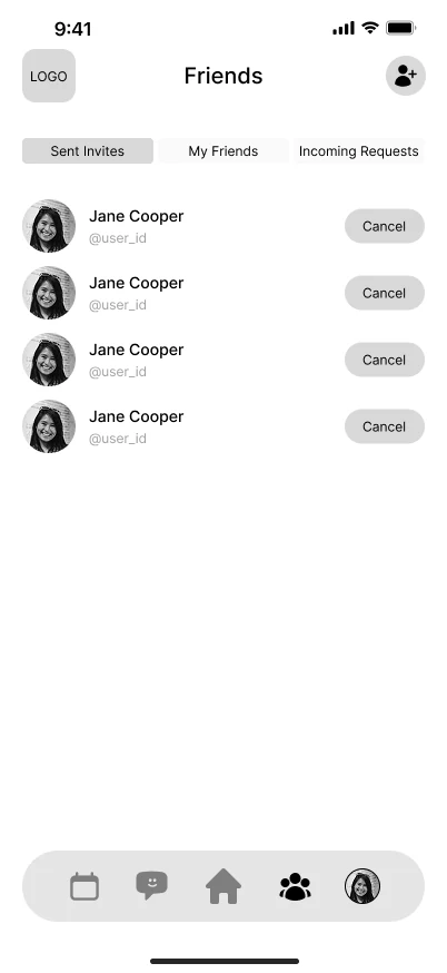
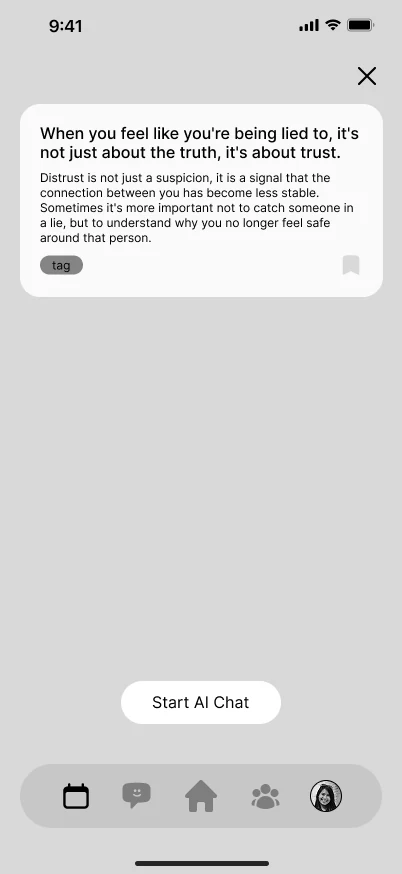
Wireframes
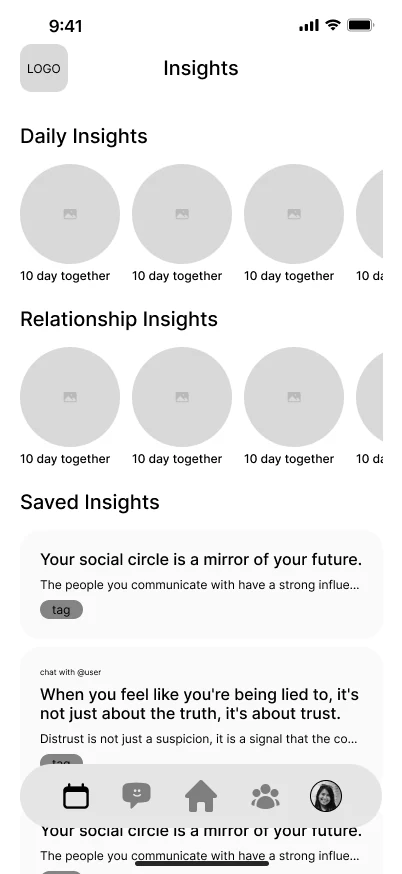
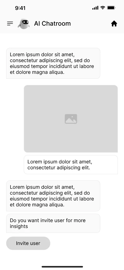
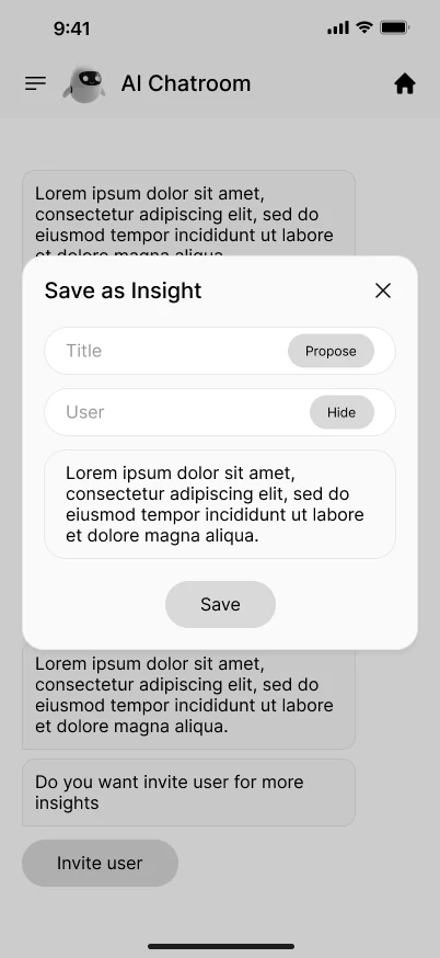
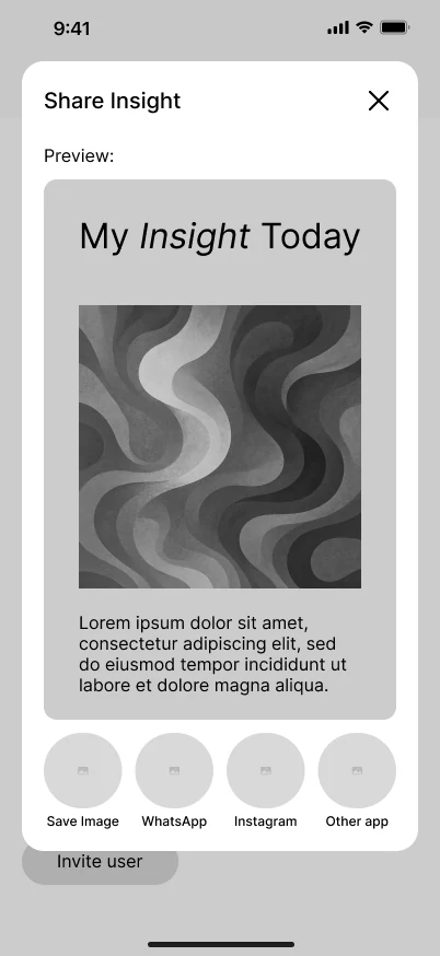
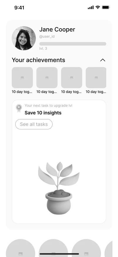
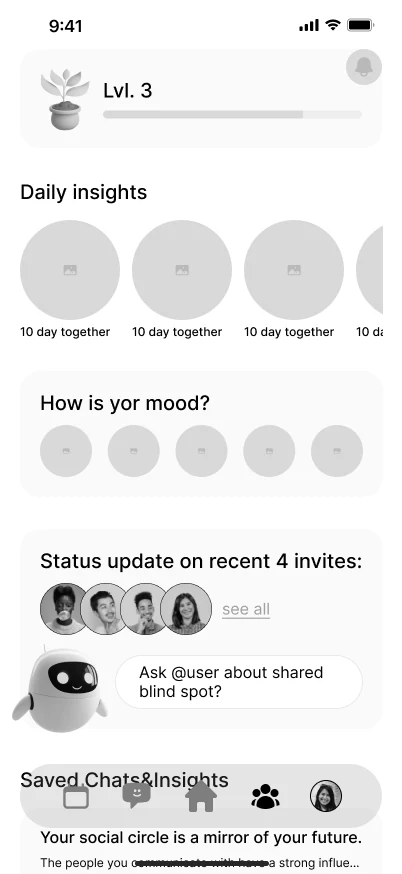
From low-fi wireframes to clickable prototypes
I proposed the low-fi wireframes myself, then moved on to clickable prototypes and high-fidelity UI.
Design system
Consistency was the product
The app has a small design system that I built in Figma and documented page by page. It has three layers. Primitive colours sit at the bottom. Semantic tokens (brand, text, icon, stroke, background, action, overlay, status) sit on top of them. Components use only tokens, never raw colours. A set of colour-range variables switches the palette by archetype, so one component set serves every theme.
Everything below is rebuilt as live HTML from the values in that Figma documentation, not pasted as screenshots. The app uses Inter; this site uses Nexa.
Colours Semantic tokens
Each token points at a step of a hue palette (for example teal/300 or grey/800), so changing that step updates every component that uses it. Overlay tokens are white or black at 30% and 10% (not shown), and there are ghost-30 and ghost-60 surfaces in white at 30% and 60%.
Brand
- brand/teal#85CBCD → teal/300
- brand/blue#B4CDED → blue/300
- brand/purple#C6C6EC → purple/300
- brand/pink#EBB6C0 → pink/300
- brand/orange#FBC78E → orange/300
- brand/green#A7D676 → green/300
Text
- text/primary#14262A → teal/950
- text/secondary#435155 → grey/800
- text/disabled#A1A8AA → grey/400
- text/on-dark#FAFFFF → teal/50
- text/secondary-on-dark#D0D4D4 → grey/200
Icon
- icon/primary#435155 → grey/800
- icon/teal#3E969C → teal/500
- icon/disabled#A1A8AA → grey/400
- icon/on-dark#FAFFFF → teal/50
Stroke
- stroke/dark#435155 → grey/800
- stroke/grey#D0D4D4 → grey/200
- stroke/light#FAFFFF → teal/50
- stroke/teal#85CBCD → teal/300
- stroke/blue#B4CDED → blue/300
- stroke/pink#EBB6C0 → pink/300
- stroke/green#A7D676 → green/300
- stroke/orange#FBC78E → orange/300
- stroke/purple#C6C6EC → purple/300
Background
- bg/background#FAFFFF → teal/50
- surface/teal#E2F8F9 → teal/100
- surface/blue#E5EFFA → blue/100
- surface/green#E5F3D4 → green/100
- surface/pink#FCF4F5 → pink/50
- surface/orange#FEEDD6 → orange/100
- surface/purple#EEEEF9 → purple/100
Action
- action/teal#5AB2B6 → teal/400
- action/blue#96B1E3 → blue/400
- action/purple#AAA8E0 → purple/400
- action/pink#DF8D9E → pink/400
- action/orange#F79440 → orange/400
- action/green#8DC655 → green/400
- action/disabled#EAEBEC → grey/100
- action/on-dark#FAFFFF → teal/50
Text styles Inter
Font size, line height and letter spacing are separate tokens, combined into thirteen named styles. Four weights: Regular 400, Medium 500, Semi Bold 600, Bold 700.
Display
28px · Bold · lh 34 · ls −0.5
Onboarding titles, splash screens, hero moments. Max 2 lines.
The quick brown fox jumps over the lazy dog
Heading 1
24px · Bold · lh 30 · ls −0.3
Page titles, main screen headers. Always first heading on screen.
The quick brown fox jumps over the lazy dog
Heading 2
20px · Bold · lh 26 · ls −0.2
Section headers, modal titles, card main titles.
The quick brown fox jumps over the lazy dog
Heading 3
18px · Semi Bold · lh 24
Card titles, tab labels, sub-headers within sections.
The quick brown fox jumps over the lazy dog
Heading 4
16px · Semi Bold · lh 22
List headers, small section titles, row labels.
The quick brown fox jumps over the lazy dog
Button LG
16px · Semi Bold · lh 16 · ls +0.3
Primary and secondary buttons (height 48).
The quick brown fox jumps over the lazy dog
Button SM
14px · Semi Bold · lh 14 · ls +0.2
Small buttons, chips, tags (height 36).
The quick brown fox jumps over the lazy dog
Body LG / Med
16px · Medium · lh 24
Emphasised body copy, descriptions, intro paragraphs.
The quick brown fox jumps over the lazy dog
Body LG / Reg
16px · Regular · lh 24
Main body text, longer content, reading-heavy screens.
The quick brown fox jumps over the lazy dog
Body MD / Med
14px · Medium · lh 20
Secondary body, emphasised list items, input values.
The quick brown fox jumps over the lazy dog
Body MD / Reg
14px · Regular · lh 20
Secondary body, helper text, form descriptions.
The quick brown fox jumps over the lazy dog
Caption / Med
12px · Medium · lh 16 · ls +0.1
Labels, timestamps, badges, metadata, tab bar text.
The quick brown fox jumps over the lazy dog
Caption / Reg
12px · Regular · lh 16 · ls +0.1
Secondary captions, fine print, supplementary info.
The quick brown fox jumps over the lazy dog
Icons Selection from the library
The library has around ninety icons, each as outline and filled, on a 24 px grid with a 1.5 px stroke. Sizes are tokens: 16, 20, 24, 36 and 48 px. These are exported from Figma as SVG, a selection of the most used.
Sizes
- icon-xs · 16px
- icon-sm · 20px
- icon-md · 24px
- icon-lg · 36px
- icon-xl · 48px
Buttons
One component, three sizes (36, 40 and 48 px high) and four types. The primary action uses the orange-to-green gradient, one per screen. Pressed darkens the gradient by about 10%; disabled uses the disabled action and text tokens. Besides this default there are nine colour themes (teal, blue, pink, green, orange, purple, success, destructive, ghost), each with the same three states.
Types × sizes
Default
Outline
Underline
Icon only
sm · 36 px
md · 40 px
lg · 48 px
States
Default
Pressed
Disabled
When to use which
- Primary one per view: “Continue”, “Save”.
- Outline secondary action beside a primary: “Cancel”, “Skip”.
- Underline tertiary text link: “Forgot password?”, “See all”.
- Icon only space-constrained contexts, always with an accessible label.
Inputs
Inputs are pill-shaped, 48 px high, with a 1 px grey stroke on the page background. The chat and search variants add an inline action button on the right. Toggles, radios and checkboxes use the teal action and stroke tokens.
Text input
Input with action
Search
Toggle
Radio and checkbox
Radio item
The same page also documents a calendar date picker, a range picker, a year selector and a bottom-sheet date input. Their month grids use the teal action token for the selected day.
Cards and feedback
The card catalogue covers content blocks, insight blocks, trait lists, chat messages, notifications, banners, profile titles and graphs. These are a few of the simpler ones, rebuilt from their tokens.
Insight block
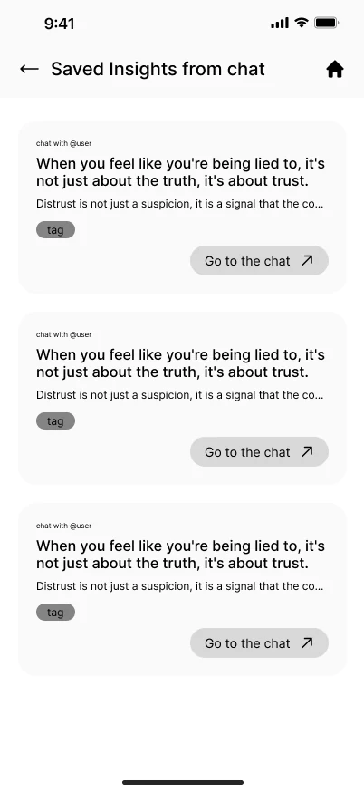
When you feel like you’re being lied to, it’s not just about the truth, it’s about trust.
Distrust is not just a suspicion, it is a signal that…
Progress bar
Banners
Notification
Illustrations
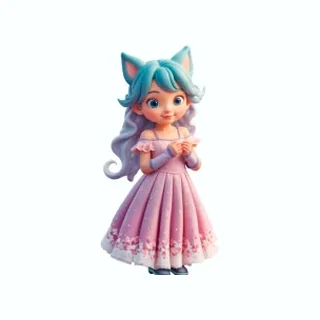
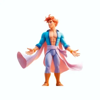
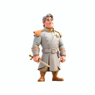
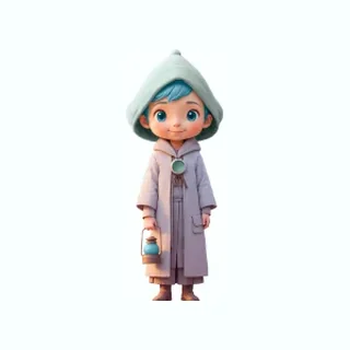
Generated with AI, made to read as one set
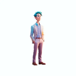
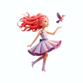
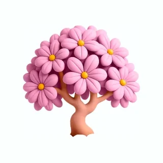
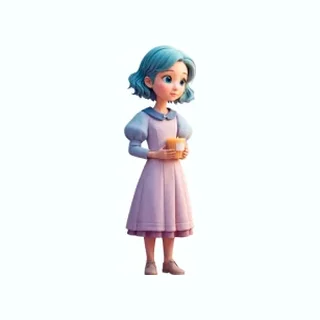
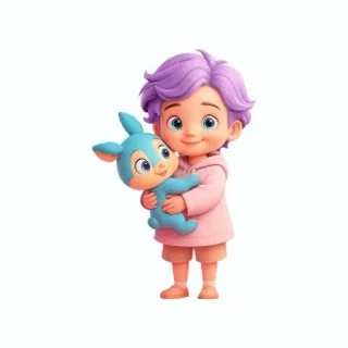
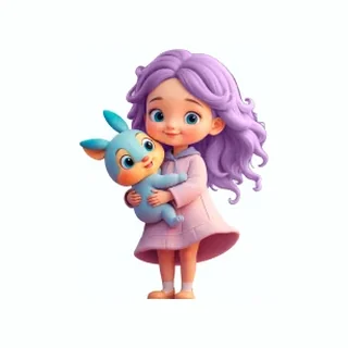
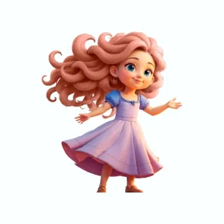
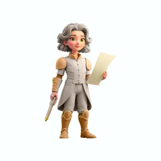
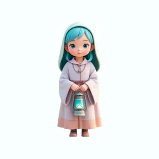
Every illustration in the app is AI-generated: twelve archetypes in a male and a female version, thirteen stages of a growing plant, and an AI robot in several moods. I generated them with Flux and Gemini. I didn’t draw them, and I’m not claiming to.
My work was making them read as one set: the same soft 3D look, the same light, colours that sit in the same palette.
























Flows
The screens, flow by flow
The Figma file holds more flows than fit here. These show how the screens connect, including the awkward states in between: locked previews, pending requests, blocking and reporting.
Six flows, in the order a person meets them. Drag a strip or use the arrows to see the rest.
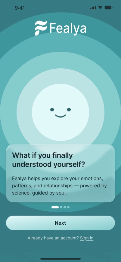
Flow 1 · Onboarding
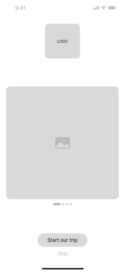
Four slides, then sign-up
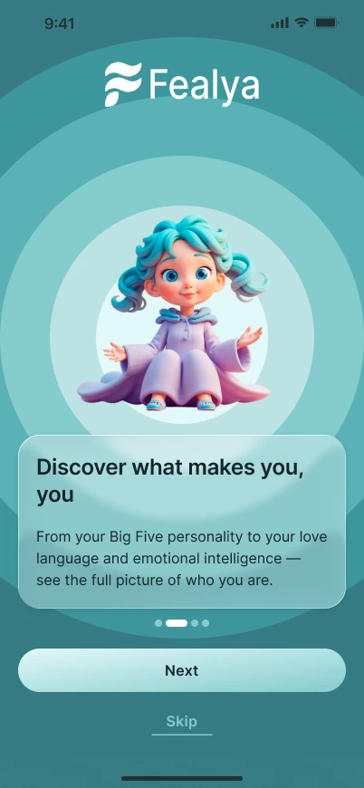
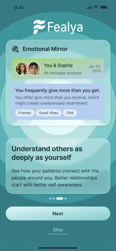
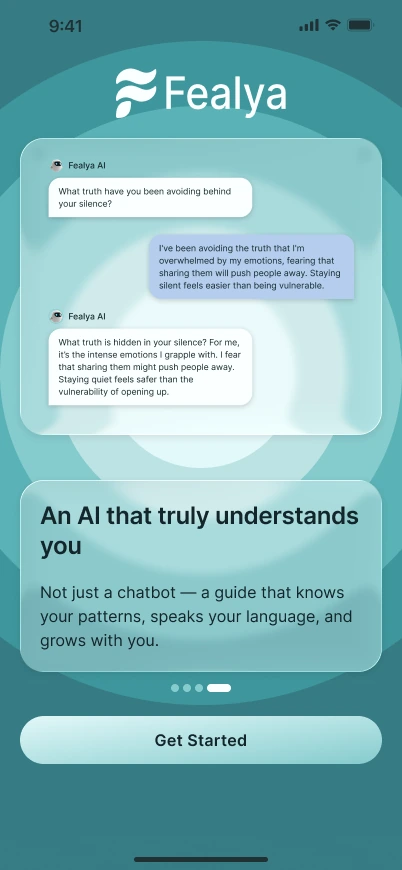
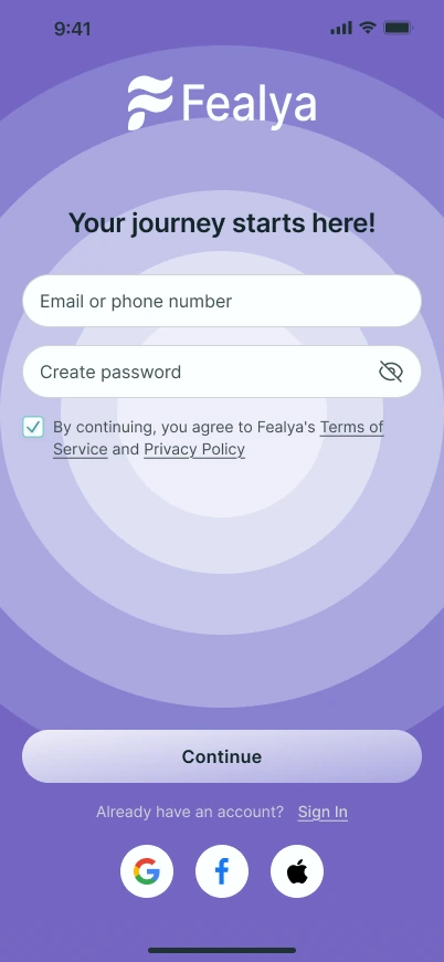
The welcome slides say what the app does in four steps: understand yourself, see the full personality picture, see how your patterns connect with other people, and talk to an AI that knows them. Sign-up comes next, with an email and a password.
The three-step sign-up is covered further down, under “Where I lost an argument”.
Flow 2 · Survey and result
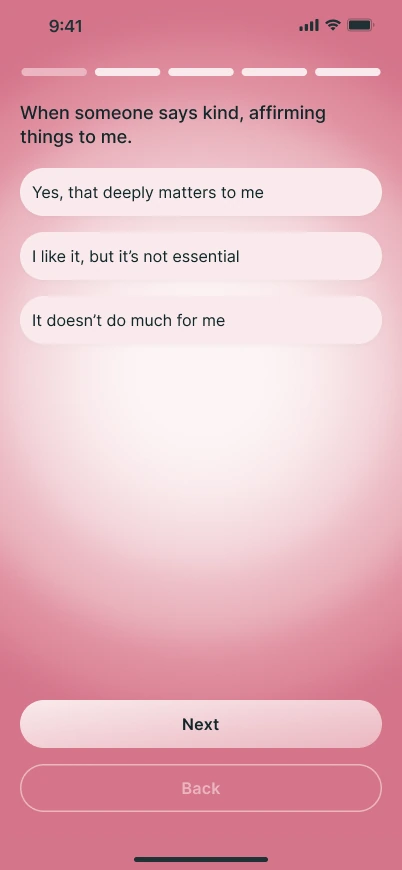
Five questions at a time, then an archetype
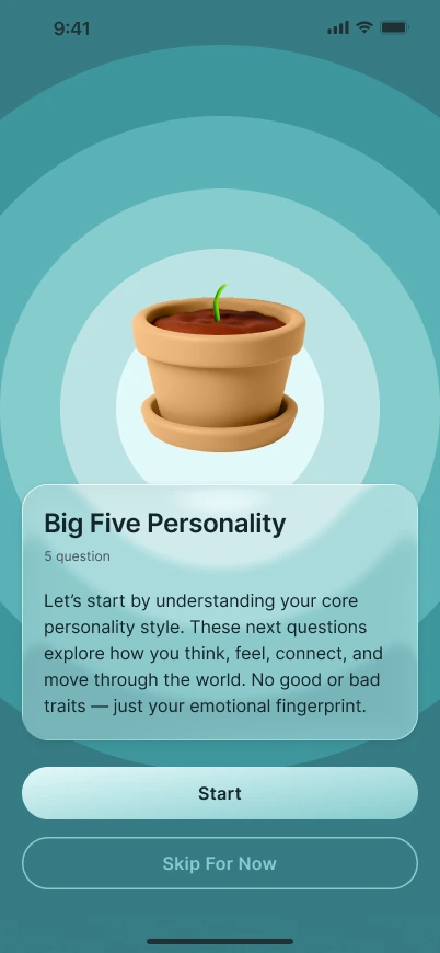
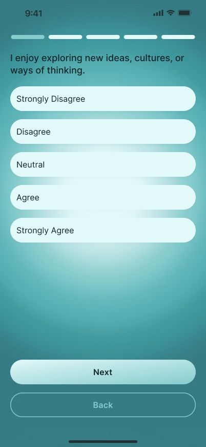
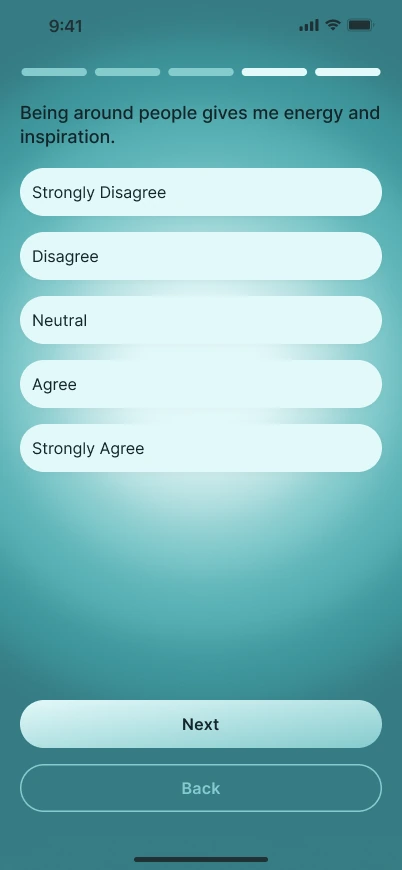
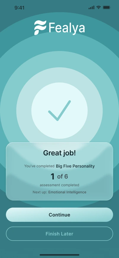
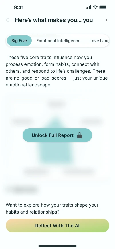
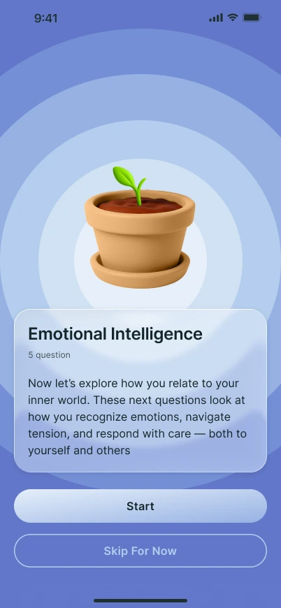
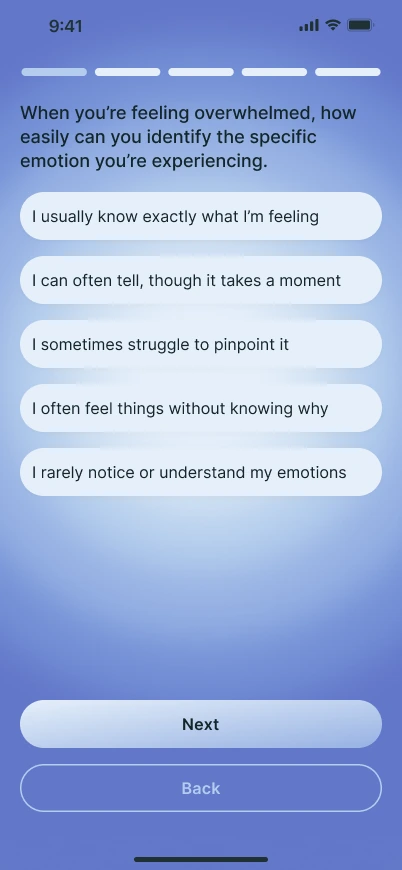
The survey has six areas: Big Five, Emotional Intelligence, Love Language, Attachment Style, Relationship Intent and Astrology. Each starts with a short intro, asks five questions, and ends with a “Great job” screen that counts how many areas are done. Every area has its own colour.
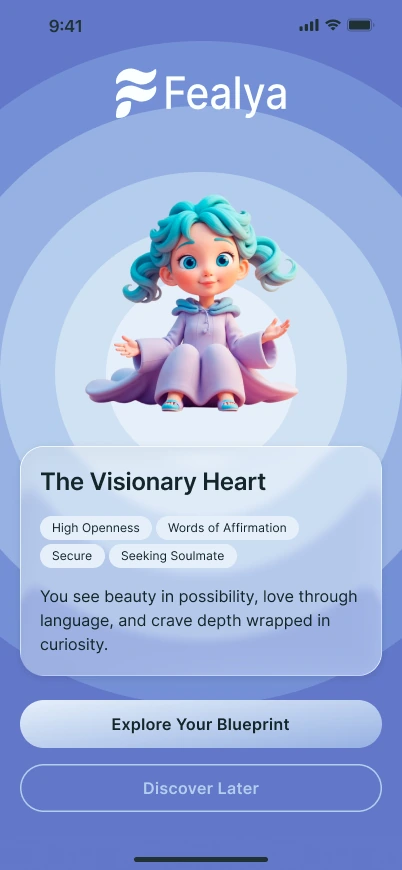
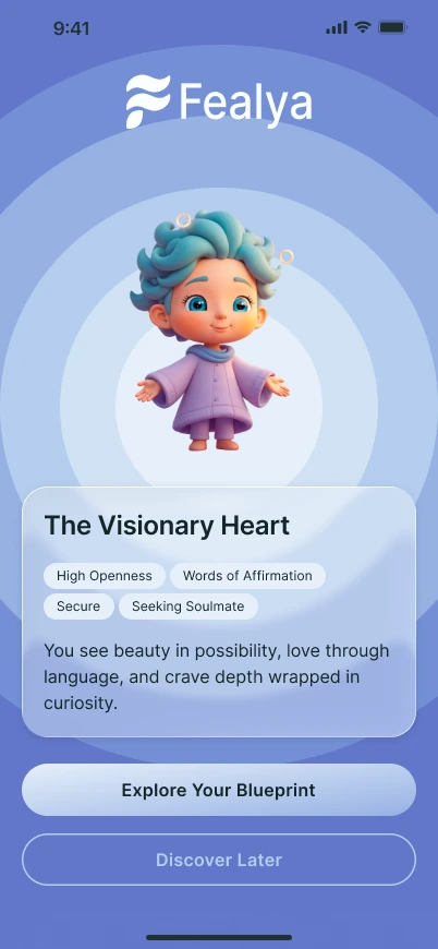
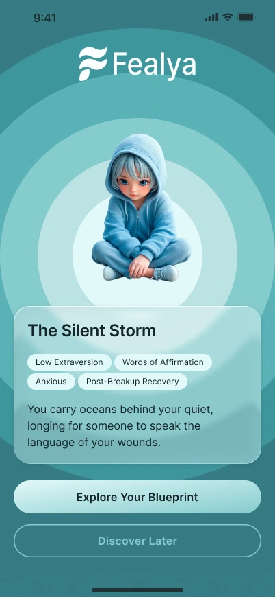
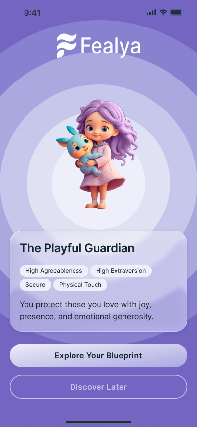
The result is one of twelve archetypes, each in a male and a female version, with traits as tags and one line of description. The full report sits behind an Unlock Full Report button; the preview shows it blurred.
Flow 3 · Chat
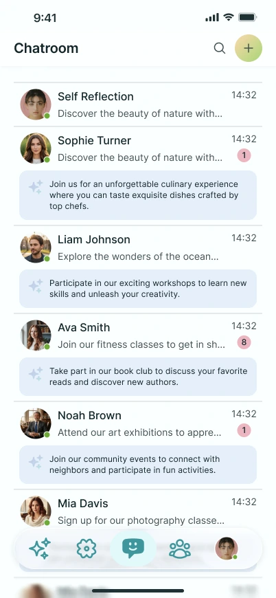
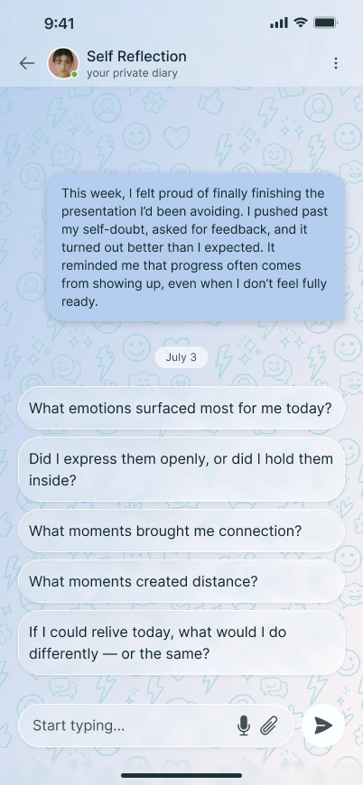
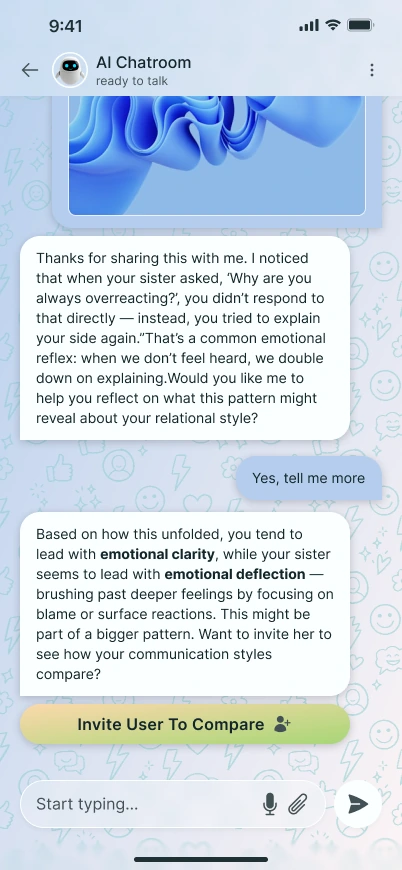
A diary, an AI and the Mirror
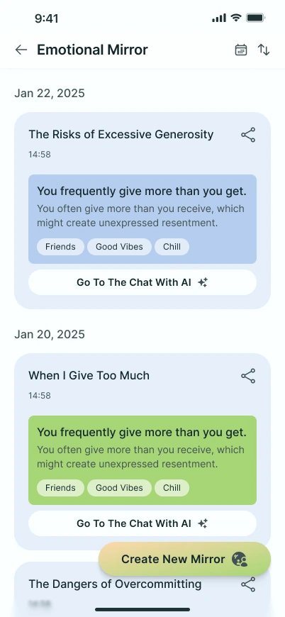
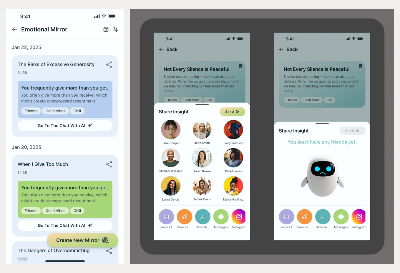
The chatroom lists conversations, with a private Self Reflection diary at the top. The diary offers ready-made questions to answer. In the AI chat, the AI comments on a pattern and can invite someone to compare. Emotional Mirror keeps a dated history of what the AI found.
The Mirror was the client’s idea, more on that below.
Flow 4 · Insights
Open, ask, save, share
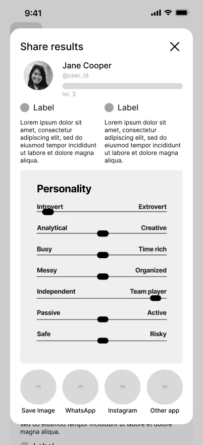
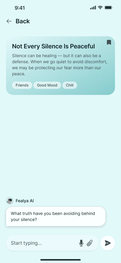
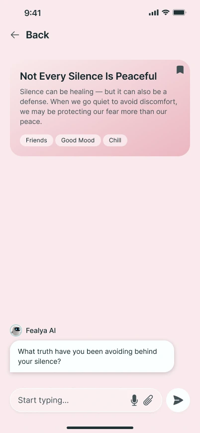
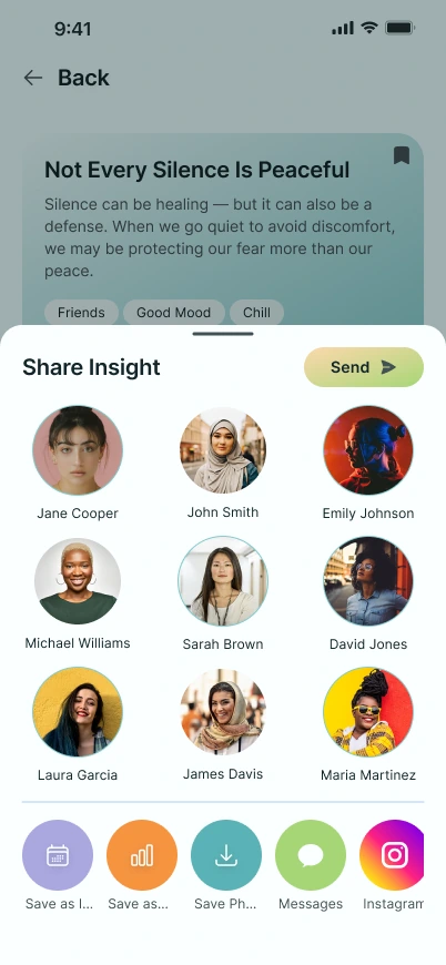
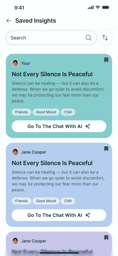
An insight is a short card with a title, a few lines and tags. Opening one starts a conversation: the AI asks a question about it. Insights can be saved to a list and searched later, or shared with friends and in other apps.
The same card is shown here in two colours.
Flow 5 · Connects
Invite, relate, compare
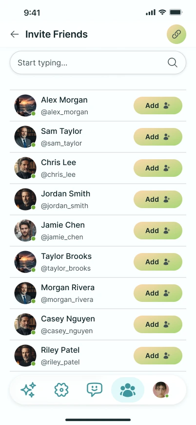
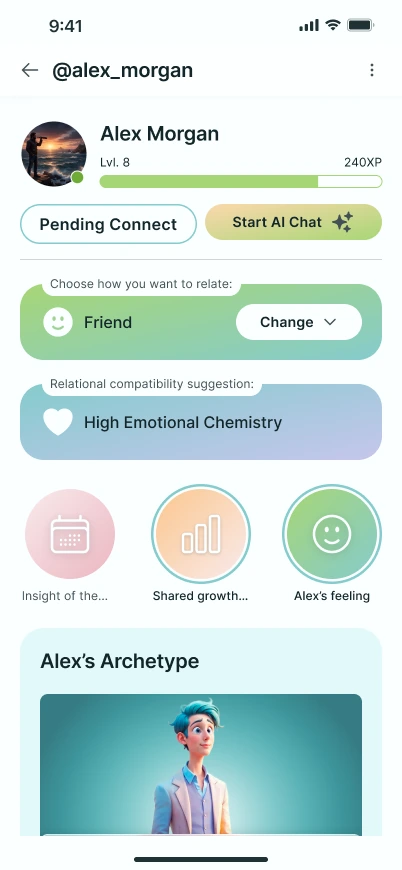
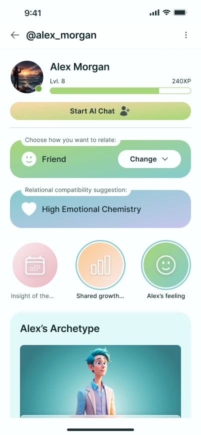
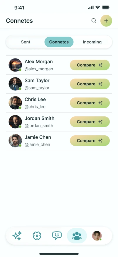
People are invited from a searchable list with an Add button. The profile of someone you invited shows Pending Connect; once they accept, you pick how you relate (friend, romantic, family or work) and the app suggests a compatibility.
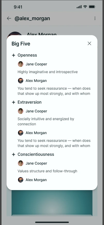
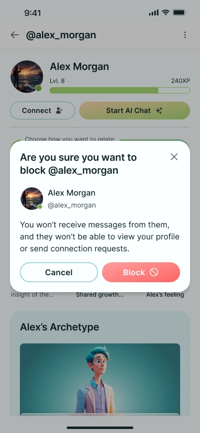
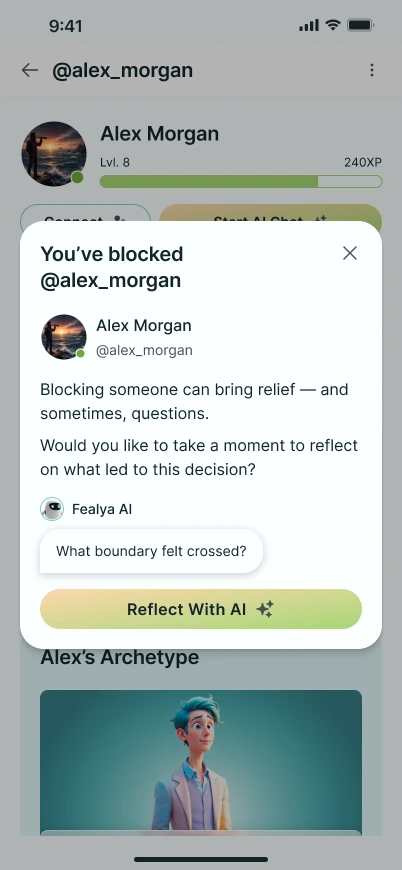
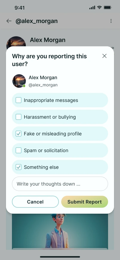
The Connects list has a Compare button for each friend. It puts two people’s traits side by side. The same profile has the awkward states too: blocking, with a gentle prompt to reflect afterwards, and reporting with reasons.
Flow 6 · Profile
You, your report, Go Deeper
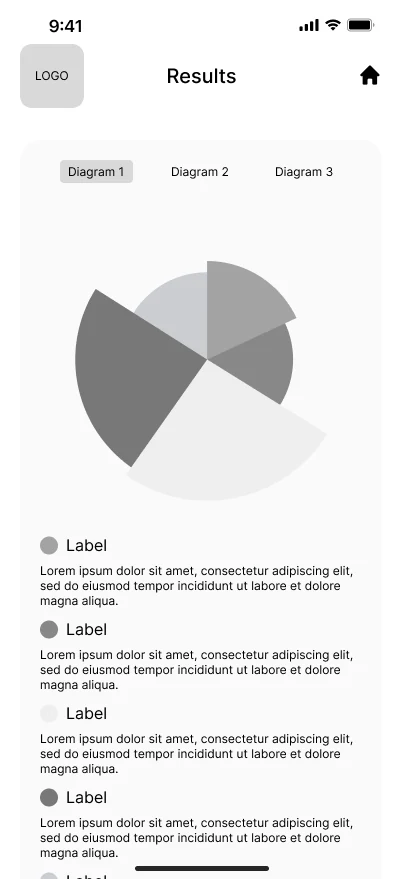
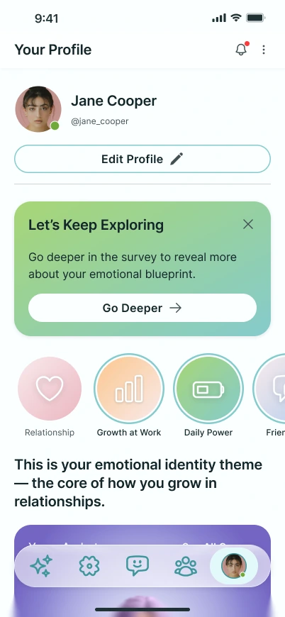
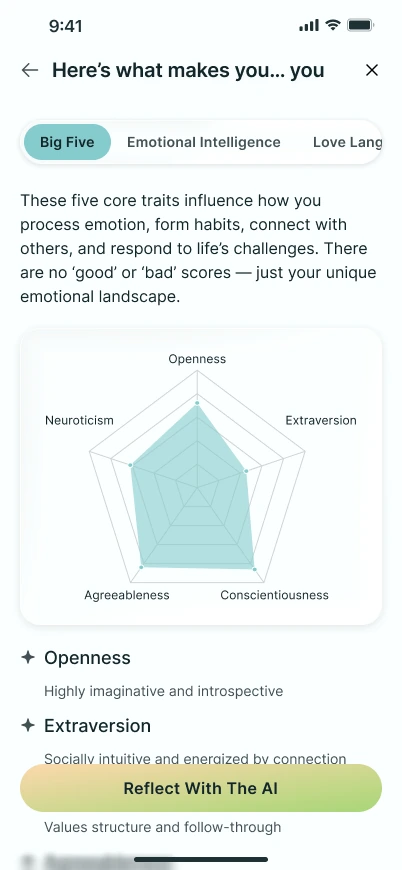
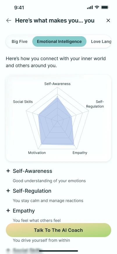
The profile has an Edit Profile button, a card that sends people back to the survey, and circles for the core themes. Each personality area has its own tab with a radar chart; Big Five and Emotional Intelligence are shown here.
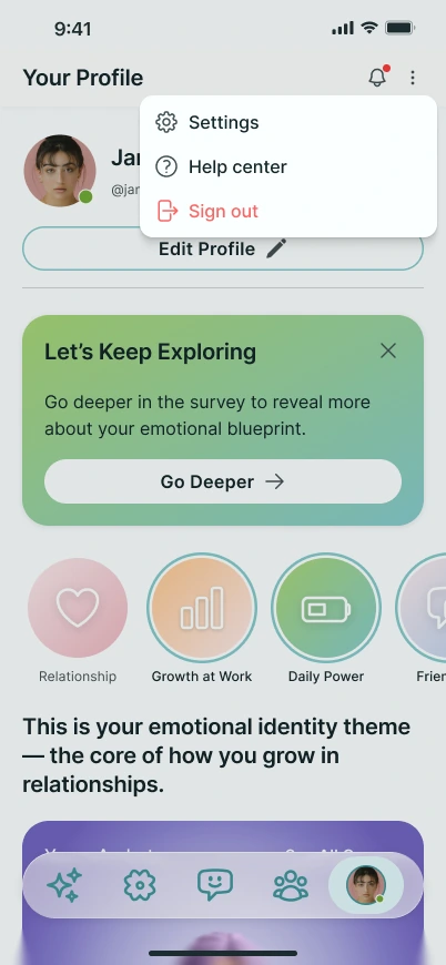
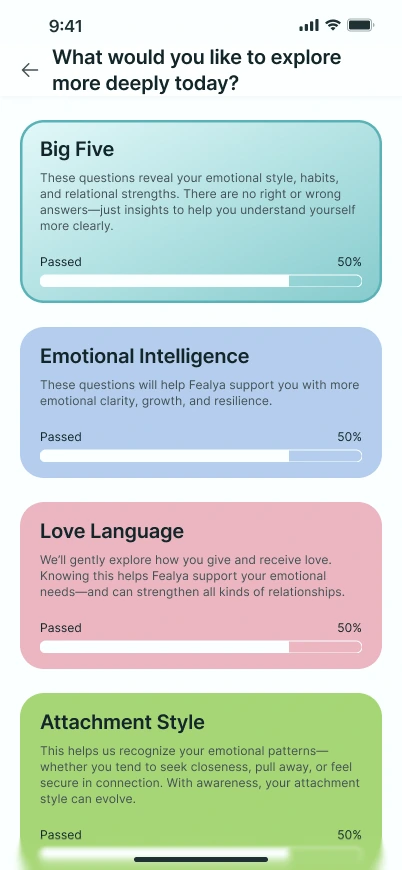
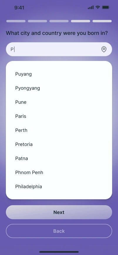
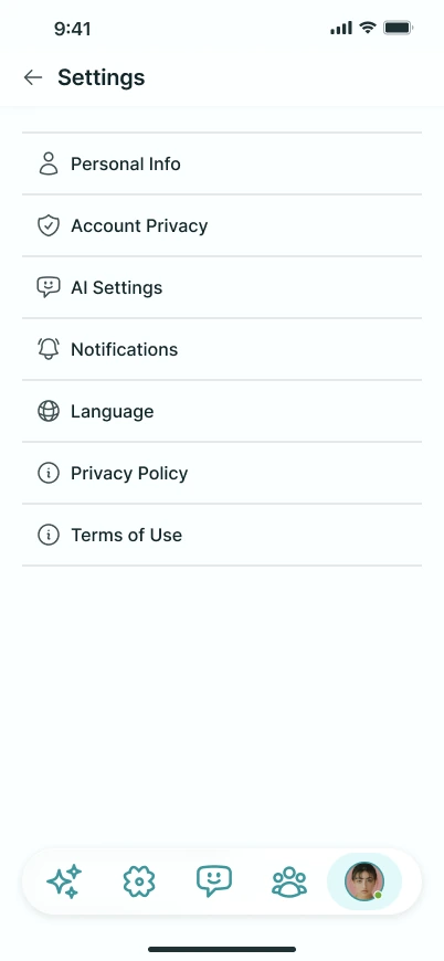
Go Deeper lists the survey areas as cards with a progress bar, plus “Surprise Me” and “I’m Not Sure — Guide Me” for people who don’t know where to start. Each area opens the same way as in the first survey, and some questions need more than a button, like the birthplace question with city suggestions. Settings sit behind the menu.
Flow · Emotional Mirror
I designed the Mirror screens. I didn’t pick the feature.
Two of the main features were the client’s decisions. My part was to make them work on screen.
The client’s feature, my screens
The AI reads a conversation between two people and names the pattern. The idea came from the client’s own ChatGPT experiments. I designed the history list, the date filter and calendar, the share flow and the report. He sent two rounds of suggestions for it, including reactions, a clearer headline and a colour choice when sharing. The only one I can find in the final screens is the ✨ marker on the AI chat button. I didn’t explore alternatives to the feature.
The client’s script, my flow
The client decided there would be a short preview before the full survey, and he supplied every question. I designed the flow and the screens. I can’t say whether a preview helps people finish the long version. Nobody tested it.
Flow · Onboarding
Where I lost an argument: onboarding in three steps vs one screen
The developer wanted every sign-up input on one screen. I recommended splitting it, so people aren’t hit with many fields at once: email and password first, then name, gender and birth date, then the questions about their motivation.
The TestFlight build used the one-screen version. My three-step flow stayed in the Figma file.
Results
Handed over because the client asked for it
In June 2025 the client asked for a documented component library, screens for common states (loading, error, empty, disabled), animation notes and clean file naming before animation work began. That became the documentation file in Figma.
No metrics, no release, no user feedback. I’m not going to dress that up.
Client feedback
“I liked your direction.”
“The UI looks really strong and cohesive. I appreciate how consistent everything feels.”
“Amazing work — very close to final!”
Client name withheld. This is the only feedback I have. It comes from the person who hired me, not from users.
What I’d do differently
Without users, my opinion was the only argument I had
I took this project without any user research, and I wouldn’t take it on those terms now. I’d insist on user testing and a competitor review before drawing screens. It would also have given me something better than an opinion in the onboarding argument.
More work